Thursday, December 2, 2010

Final Booooook


Reflection noitcelfeR:

I think the most important skill I’ve learned in this class isn’t how to use a specific Photoshop tool, but how to manage my time accordingly. Sure, frequent use of the pen tool and learning key strokes to hasten the creating process has come in handy, but I’ve learned that time management is the most important aspect when tackling any project, especially one as intricate and arduous as the book assignment.

While making my book, I hit a lot of speed bumps. All the decisions I made, whether thought out or last-minute, were crucial to the creative process. For instance, I never intended to make a coloring book. At first I planned on making a graphic illustration book with a ton of nauseating 80s colors, but once I saw my images printed out with their crisp lines, I thought they loaned themselves beautifully to this new idea. I’d like to say I was clever enough to come up with this idea as a major time-saver, because let’s face it-not having to color the pictures would save loads of time, but that wasn’t the case. The only major problem I ran into involved the colors on the cover, inside cover, and back cover of the book. Coloring the images in Photoshop using RGB colors made them look vivid and hard to look at, like I wanted, but I was later informed no printer could create those colors exactly as they appeared on the screen. I tried working in CMYK to get a more accurate preview of what the final prints would look like, but seeing the colors so horribly skewed made me upset almost to the point of crying. When I spoke with Professor Inada on the subject, however, he said “Just go for it!” By this he meant I should just keep creating RGB images. He reassured me that the printer will get close enough to the colors I wanted and I think he was right-the final images look great!

In the near future, I plan to make dozens of copies of my coloring book to distribute to the kids my boyfriend works with. He helps teach and watch the kids at recess at a nearby elementary school, and in the past he and I have created assignments for them to color. Our drawings are always a hit and something that never changes from generation to generation is simply that kids love to color! They will even color at recess! I can’t wait to show them my book-I’m sure I’ll be able to chalk it up to another successful child-friendly activity!
Wednesday, December 1, 2010

Wednesday, November 17, 2010

Friday, November 12, 2010

Drawrings Fo Muh Book

80s Dinos it is (DUH ;p)! 6 mock-up pages down (sans text...debating whether to use use it)! BOOYAKA!!!


New cover...still don't like it haha

Monday, November 8, 2010

Book Prepozalz

I have three main ideas for seperate books-each with different demensions:

Idea 1: A word-free, picture-heavy book of dinosaur-shaped pages. The dino template will be the same for each page, but how each dino is colored, patterned, or straight drawn will change. I want it to be big and graphic with a set color scheme of neon greens and pinks with lots of overly-saturated purple. This idea sounds like it would be crazy fun in execution and would most likely be fun to "read".

Idea 2: A conceptual book using text in an artistic sense while also retaining some legibility. In a sentance, this book will acheive to be "a legible abstraction of my cosciousness". I would want the format to be 8.5 x 11 and for each page to look like a graphic, well-thought-out poster. Very artsy. Very modernized. And pretencious? You bet!

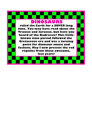
Idea 3: This one would just be self-idulgence: a book of different dinosaurs dressed in 80's over-the-top fashion. This book would mix my 2 favorite interests (even if the latter is more a cosmetic interest). I've been obsessed with dinosaurs since I was a wee lad and 80s fashion is so awesomely bad that the irony of appreciating it years later is too fun too ignore. I'm thinking it will be smaller than the first two ideas and each page will include a little stanza (possibly rhyming to amp up the radness/sillyness?) about each bitchin' dino. Me thinks lines from 80s pop music may come into play? If I do pick this theme, know this: It will be colorful. It will be rediculous. It will be win.

I like all of these ideas and just need to commit to one...maybe I could get some fancy, official feedback from my instructors, yes?

Friday, November 5, 2010

Friday, October 29, 2010

Posterized


For this assignment, I couldn't help myself-the idea of making an imaginary band poster made me so giddy I decided to do so for both posters. This was probably because creating 2-D art for musical artists is kind of sort of a small dream of mine, and this project allowed me to pretend I was in that normally unattainable position. To make up for this blatant rule violation, the result of my relentless addiction, I offer an extra (yes, extra!) poster. Please accept this third piece-my free gift to you-as compensation for falling off the wagon. Thank you.

Naturally, the band name I chose eludes to my musical heroes, who I had the honor of meeting recently (see previous post), Foals. I went with "Quadrupeds"-four-legged animal, plural, sans the cliche "The" before it equals an homage to a great indie/electro-funk band without directly ripping them off. The idea is that Quadrupeds is a three piece band and each of us (Ian Chachere, Jenny Kladzyk, and myself-totally wish this was reality) got to steal the spotlight for each poster.

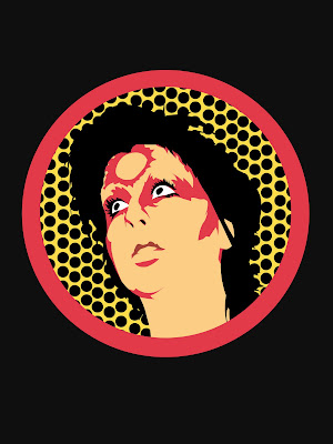
I used the iconic imagery of a more famous hero of mine, Ziggy Stardust himself-the great David Bowie, to catch people's attention. I figured mimicking the cover of his "Heroes" album was an appropriate choice for the poster I'm depicted in. Jenny's picture was based off a Bowie tour poster that utilizes five flat colors and circle shapes, and Ian of course donned the famous lightning bolt across his mug.

These images differ from any I've done before because each poster required a photo shoot of sorts. Each modded photo required a model, specific location, specific pose and, the most difficult and time consuming aspect, complex make-up. All of the "war paint", as my uncle calls it, was done by yours truly. That part took a while, but was fun and something I had total control over. That's why the hardest shot to get wasn't of my friends and their intense make-up, but my own shot. I had no control over the camera angle or positioning of myself to match the unmatchable Bowie pose. We had to take five times more pictures for that poster than the other two to finally achieve a semi-correct pose. A photoshop tool I used more intensely than in any of my previous images in this class was the pen tool for Jenny's (third) poster. I carefully cut around sections of her photo to capture all the meticulous details in her face and especially her hair. Complicated selections like that are fun, but tedious. It took so long that I never got a chance to add text to the silly thing!

I plan on finishing up the third poster soon and in the mean time hope our next assignment is equally as fun and challenging!

Sunday, October 24, 2010

Portraits/Alphabet Soup/Jesse Sucks at Photography

Self-Portrait:

Someone I Know (My "Hubby"):

The Others (FOALS!...and Jenny):


Since I'm a child of the digital age, I picked "QWErTY", the first row of the keyboard, as my Alphabet Soup letters:


This assignment was the most challenging so far. I've always known I'm a lousy photographer, but I tried not to let that thought set me up for failure or keep me from giving it my best shot. The process was tough, but I learned a lot about opening up to strangers and opening my eyes to the world outside my living room- even towards the world inside my living room-the world I tend to glaze over on a day-to-day basis.

My "other" picture was extremely exciting-I met my favorite band, Foals, when I visited Portland and asked if I could take their pictures. I didn't mention it was for an assignment because I was a little too star-struck to formulate many words. I only used one layer to effect the final "other" (or "others") photo. I wanted to add hand-written text to document the occasion in narrative form and tie all the portrait photos together cohesively. In contrast, the alphabet photos all have at least 3 adjustment layers each. I played around with the exposure, levels, hue, saturation, and contrast until the desired letters emerged the clearest. It didn't help that the only camera I own is the "Photograph" feature on my cell phone. The pictures it captures are of low quality, but I tried to make that work to my advantage by purposely amping up the grittiness of the pictures. I went for an over-exposed, warped motif that almost hurts to look at-kind of like staring at the sun.

As wonderful as it was to meet Foals, I'm glad this assignment is over with. After this enlightening journey I found out I'm at the same place I was before-I have no affinity for photography, and frankly, I stink at it.

Friday, October 15, 2010

LeTTeRS aSSiGNMeNT

"e" is for...

LLLeopard

Wunning Wildebeest

Nuttin' but a "g" thang, bush baaaaby.

EBRA

ReFLeCTiVe eSSaY:
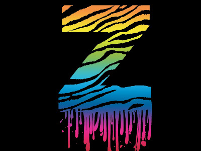
I had way too much fun with this assignment. I wanted to play with the idea of eluding to different African animals using text or using animal forms to interact with or mimic certain letters. I like to call my creations "alphabeasts"!

I have no preferance towards either serif or sans-serif fonts. I just chose whichever worked best with each piece. I rasterized all of the text so it was easier to manipulate. My favorite composition is the first one. Using "e"s to shade the elephant was a bit frustrating, but overall enjoyable...after Miles helped me figure out the clone stamp tool, of corse. I had a difficult time with the wildebeest piece. Making those complicated selections was, well...complicated. My approach towards color and composition worked well for the assignment, I feel. The pieces are cohesive, for the most part.

Creating my alphabeasts was overall a rewarding experience. I hope others enjoy them as much as I enjoyed making them!

Friday, October 8, 2010

Toy Project: "Momma 'Gator"

TAH-DAH!

Reflection Thinger:
...I got nothing. Seriously, after this assignment my brain has turned to pancake batter. I decided to create my own toy design to challenge myself-mission accomplished. After spending countless hours in the computer lab toiling over details, it's safe to say this assignment kicked my butt. Hardcore.

Everything about this project came from my noggin. I love how momma alligators gently cradle their babies in their mouth for a time after they're born. Alligators are always portrayed as ruthless predators, but the fact that they're so protective over their little babies opposes this. The juxtaposition of an alligator's killing machine stereotype versus its endearing parental ways tickles me pink. Speaking of pink, I came up with my own color scheme-I tried to pick complementary colors. The lecture on color helped me choose different hues with similar value. I could tell I succeeded because when I printed the image out in black and white, my gradients looked the same for the most part. Choosing colors was only a small step in the arduous process, however. The devils were definitely in the details for this one. I wanted to make sure the toy would actually work as a three-dimensional object the way I saw it in my head, so I kept printing it, cutting it out, and adjusting. Work, print, cut, adjust, repeat. Over and over again. Ugh.

It's still not perfect-the toy assembles correctly and the mouth even opens and closes, but the assembly instructions I wrote and drew out looked discolored because I scanned them in. I thought I adjusted them accordingly, but when I opened the image up on a different computer, it looked off. Maybe I can fix it, still...with what little brain matter I have left. And I thought I was going to sleep tonight. Rats.

Saturday, October 2, 2010

A Short (yeah, right!) Reflection

I know everything in the world about Photoshop, or "PS" as the kids say...OK, that's a little huge; maybe 70% of all things Photoshop...alright, alright, at least 10%. Or less. I must admit having a little PS experience before coming into to this class really came in handy. However, my prior knowledge only took me so far. Since being thrown back into the digital art ring, I still find myself facing a few trials and tribulations. Throughout this magical journey, I'm re-discovering my favorite PS tools, trouble-shooting my mistakes, making artistic descisions, and even eating candy bars.

I used to have an array of PS techniques in my back pocket that would impress even the surliest of haters. But, alas, unlike riding a bike, much of that knowledge was lost-probably drownded in the vast sea of song lyrics I retain in my head. The good news is that after playing around with the program for a few hours, my memory was refreshed and now I even remember a few helpful keystrokes. Also, I was once again reunited with my beloved lasso selection tool and life was good. I'm obsessed with this feature because it gives me god-like control over what's going on in my image-it can be filled, turned into a path, or leave me one click away from turning the perimeter of my selection into a line. Sweet. What wasn't so sweet? The problems I ran into (and am currently running into). I had issues posting my images onto the blog site and no one in the lab could help me. In fact, one gentleman, although only trying to help, set me back about half an hour. Some good came out of this, however. With the help of an energy boost from a Snikers bar, I figured out where I went wrong and discovered the errors of my ways. And like Confuscious say, "When one can fix his own mistake, the process of learning can begin"...alright, maybe I made that up. At any rate, I swelled with pride and patted myself on the back for learning something new. On a less technical note, the actual artistic experience was rewarding as well. I started out with 3 solid ideas that I stuck to for the most part, making only a few adjustments. Since I had a clear veiw of where I was going with the pieces and possess somewhat of an eye for composition, I knew when to put down the stylus. Overall, I like my three ideas, but the iRoar is probably my favorite. It was the easisest to make, but the most clever, I feel.

Throughout this arduous mini-essay, I've been switching tenses, but not for a lack of English 101 skills. I'm still in the process of finishing my second piece. I want to redo it-add some teeth and maybe headphones to my little dino buddy-but when I went to the upstairs computer lab today, I found out the lab schedule posted on the DMF blog was incorrect. That lab is closed all day today, but this is only a minor setback-the downstairs lab will be open for 2 hours soon. My process of remembering old techniques and continuing artsy learning (possibly while eating more candy bars) will recommense shortly!

Here was my 1st attempt at pikkie 2--refer to the revamped version in the "Scrizz-atch" post to WITNESS MY MAGIC!!!

Friday, October 1, 2010

Scrizz-atch Assignment

Pikkie 1!!

Pikkie2!!!!

Pikkie 3!!!!!
Yep...I'm pretty rad.

Wednesday, September 29, 2010

I'm the best at photoshop ever in the whole world

I maded a lil fetus friend! Now I finally don't have to be alone!

Saturday, April 24, 2010

Bingo

Soooo..while brainstorming for my final project, I was thinkin to myself, "Self, what's a good mix of obnoxious color and subject matter you won't get sick of drawing over and over?" The obvious answer: M.I.A. She's vivacious, talented, and wears some outrageous attire. I'm thinkin my main character has to be (OR be dressed like) this 5'3" bundle of badass:

I've been looking at some Paul Pope artwork lately and thought his playful style would be great to use as inspiration for my project. I was particularly captivated by this comission he did for Diesel clothing:
I'm gonna check out some of M.I.A.'s clothing line-hopefully this will help me think of an actual story...

Wednesday, April 21, 2010